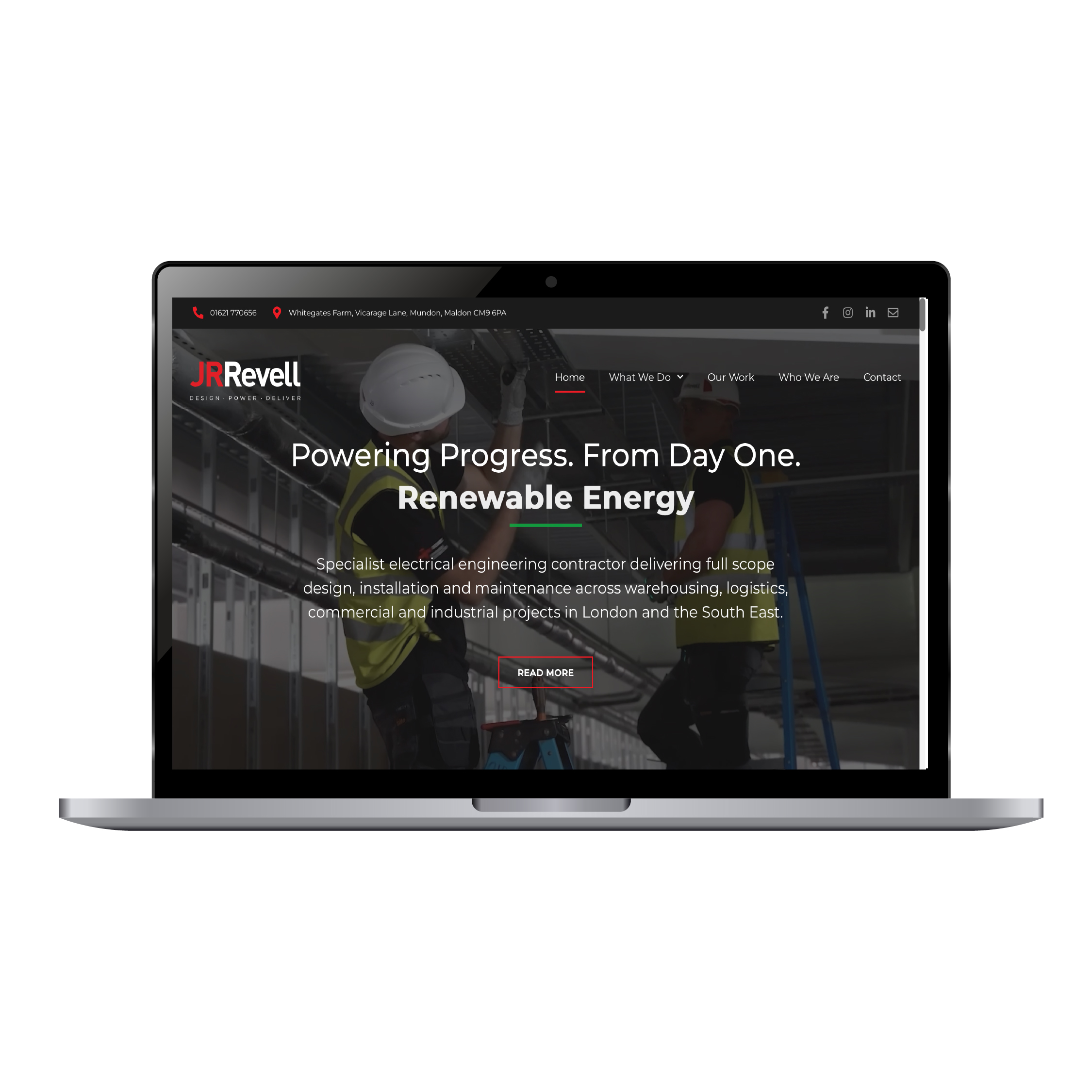

With the rebrand complete, JR Revell needed a website that worked as hard as the new identity.


A Website to Match a Brand That Had Outgrown Its Roots
JR Revell is a well-established electrical contractor based in Essex. It serves warehousing, logistics, commercial and industrial clients across London and the South East.
Following the rebrand, the business had a group identity and five clearly defined divisions. The website now needed to catch up.
The Challenge
The old website no longer matched the business.
The rebrand had repositioned JR Revell as a multi-service group. Without a website built around that structure, the new identity risked stopping at the van livery.
The new site needed to:
- Present five divisions under one brand, without diluting either
- Help buyers find the right service quickly, whether they were a procurement lead or a site manager
- Prove JR Revell could deliver larger, more complex projects
- Turn visits into calls and quote requests, on desktop and on site
Put simply, the brand had moved on. The website needed to move with it.
The Solution
We designed and built a website around the new group structure. The goal was to make the breadth of the business obvious and the next step easy.
A Brand System, Built for the Web
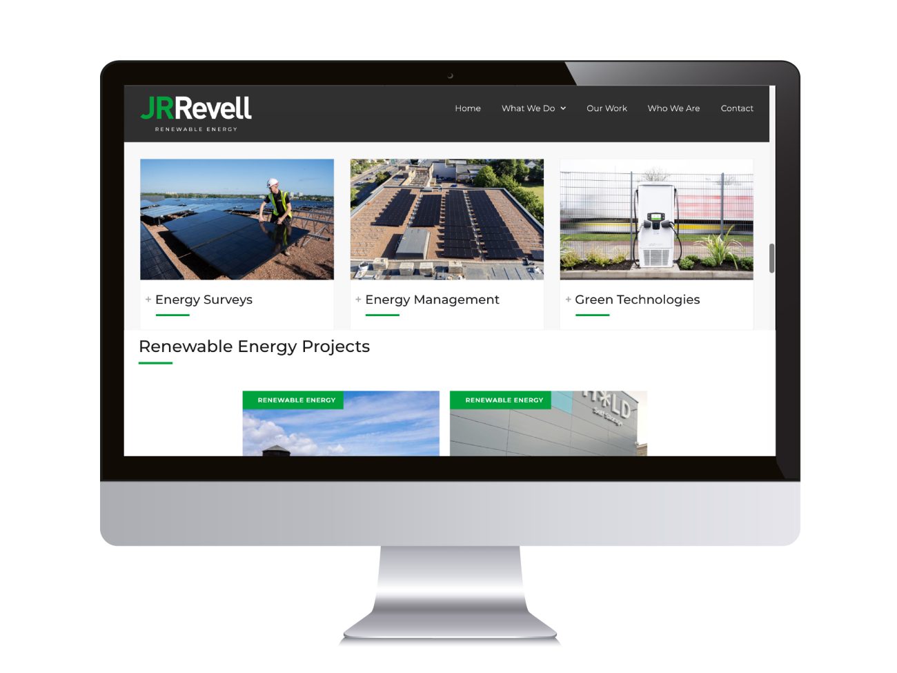
The rebrand gave each service line its own colour. We carried that system through the whole website.
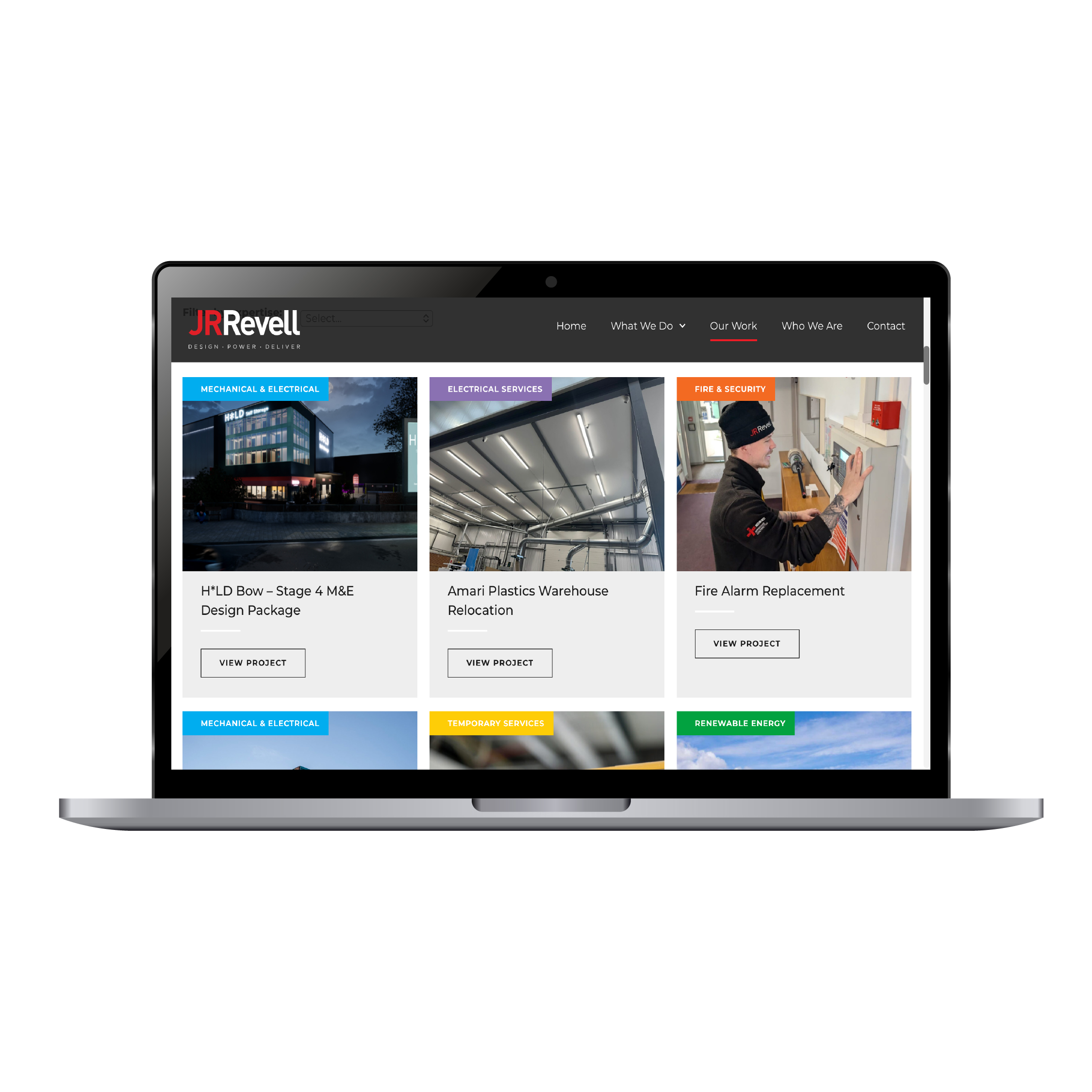
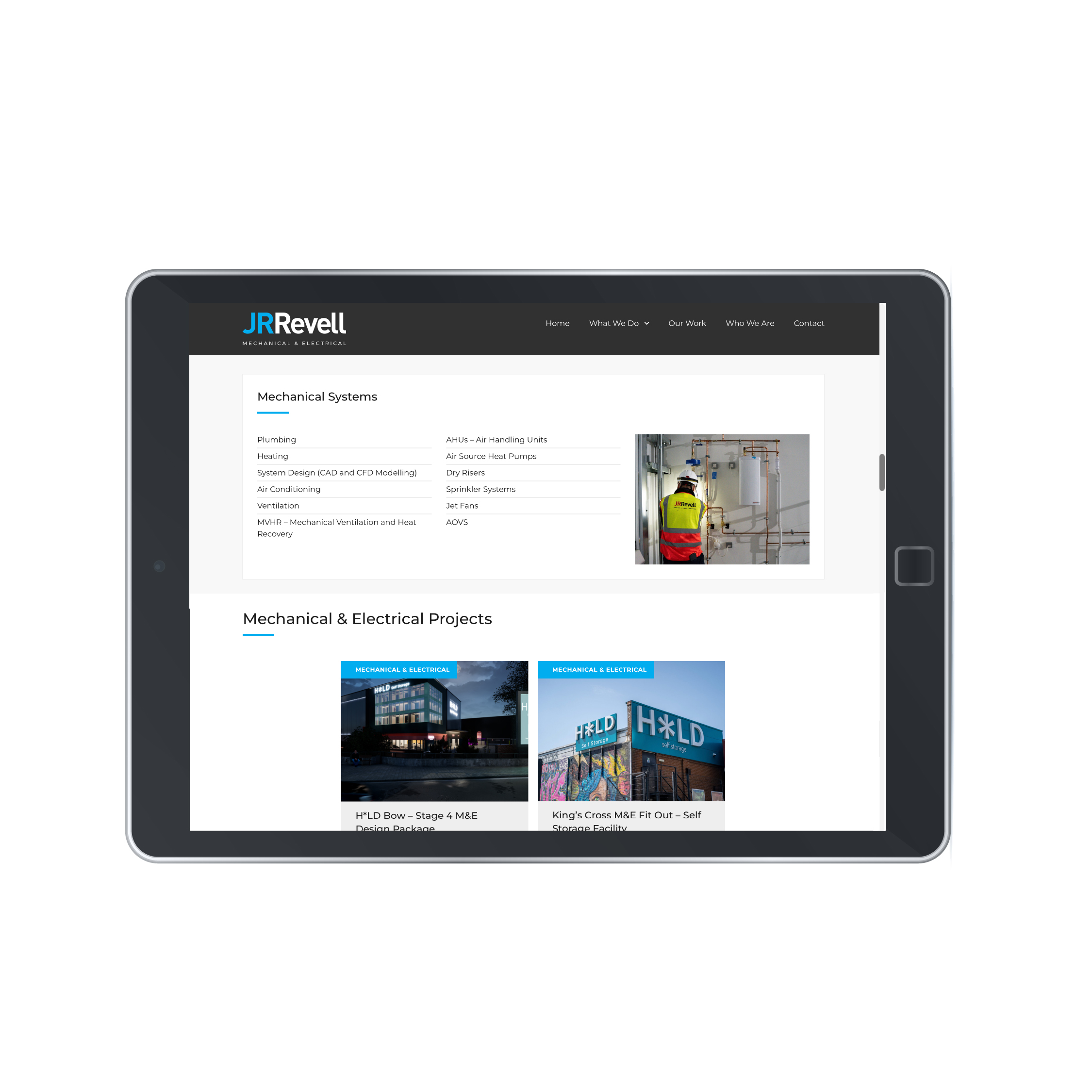
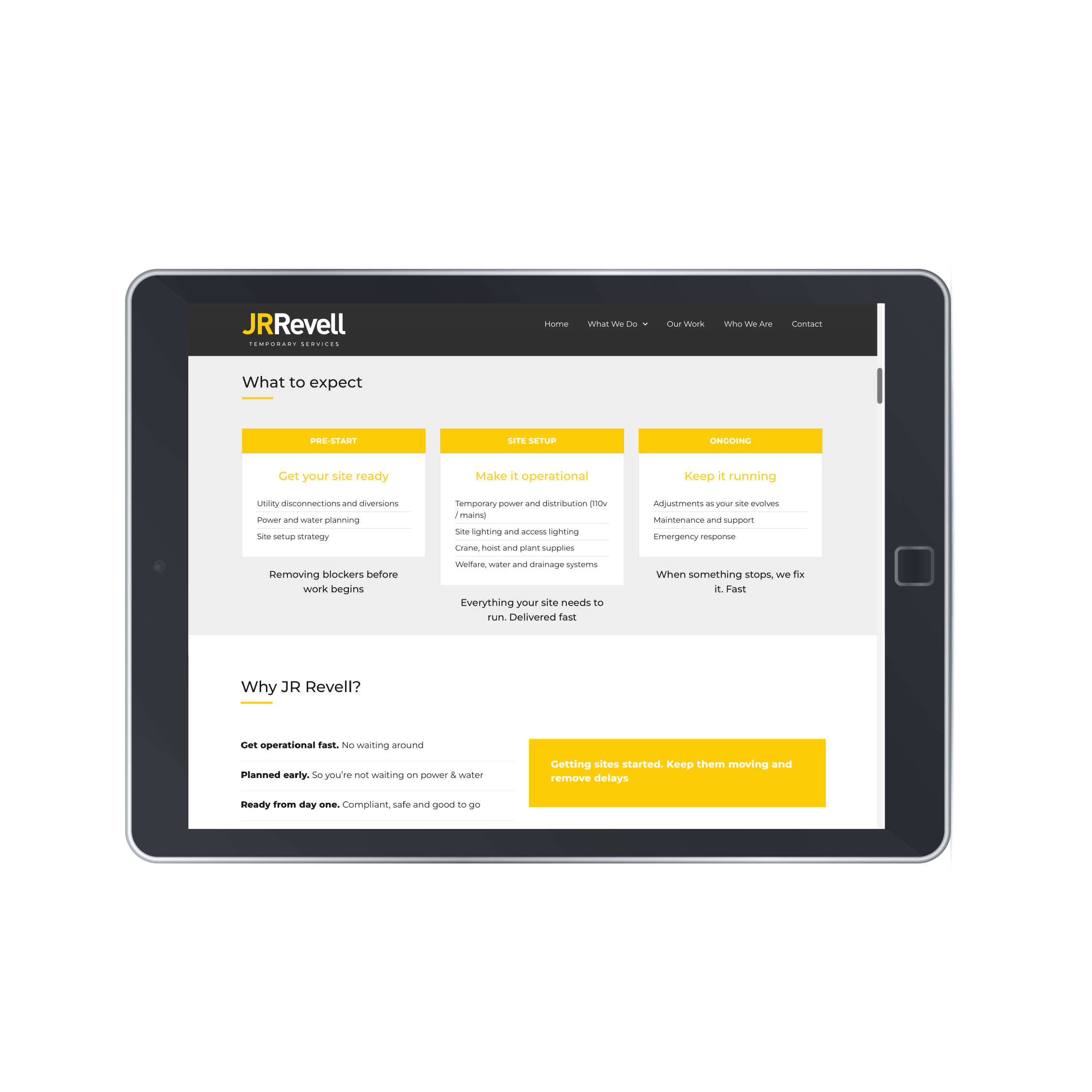
Each division has its own colour, logo lock-up, buttons and project tags:
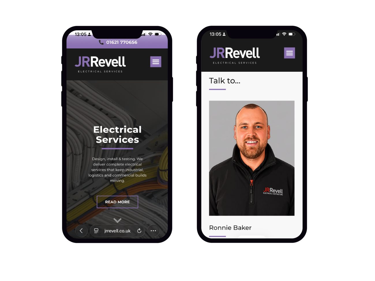
- Electrical Services in purple
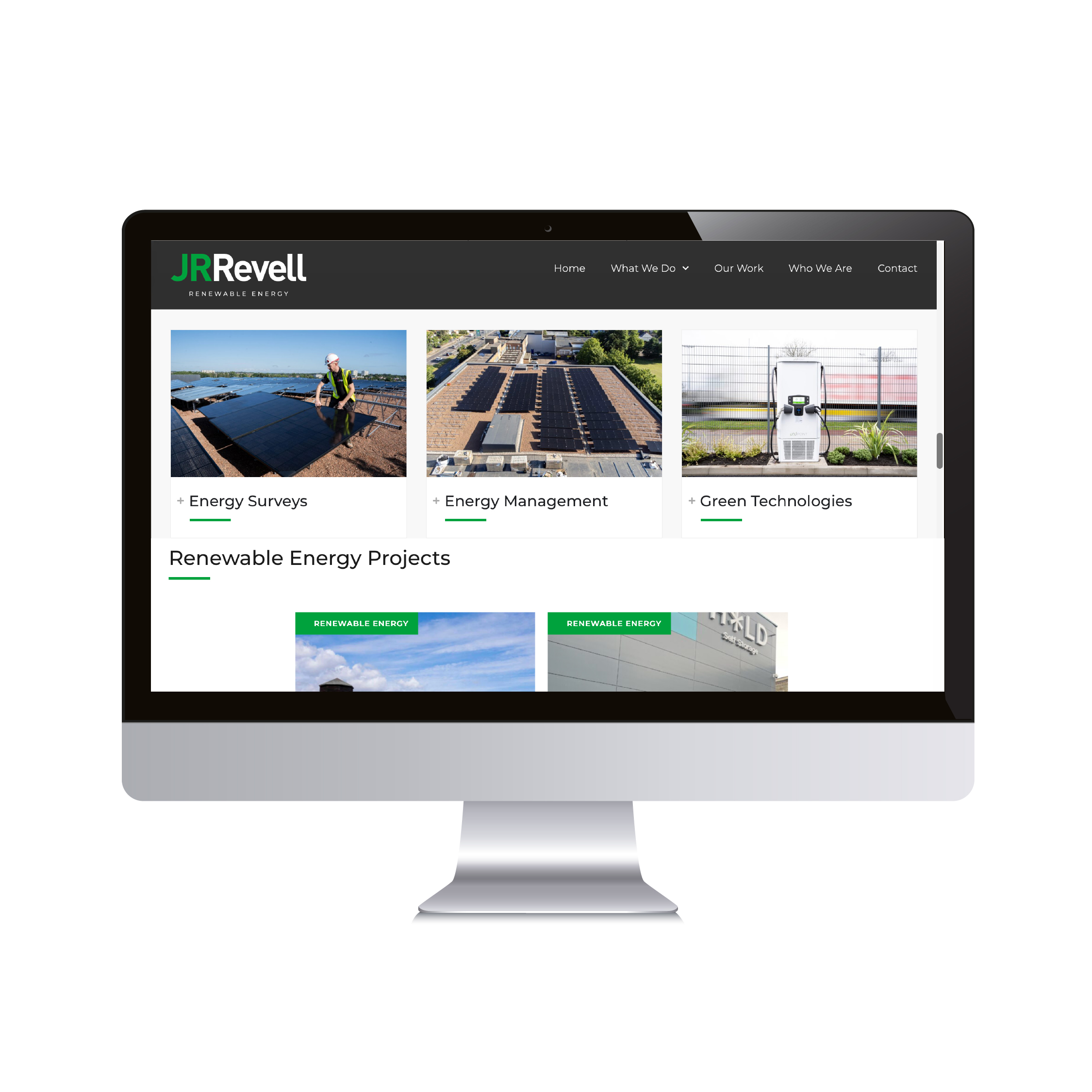
- Renewable Energy in green
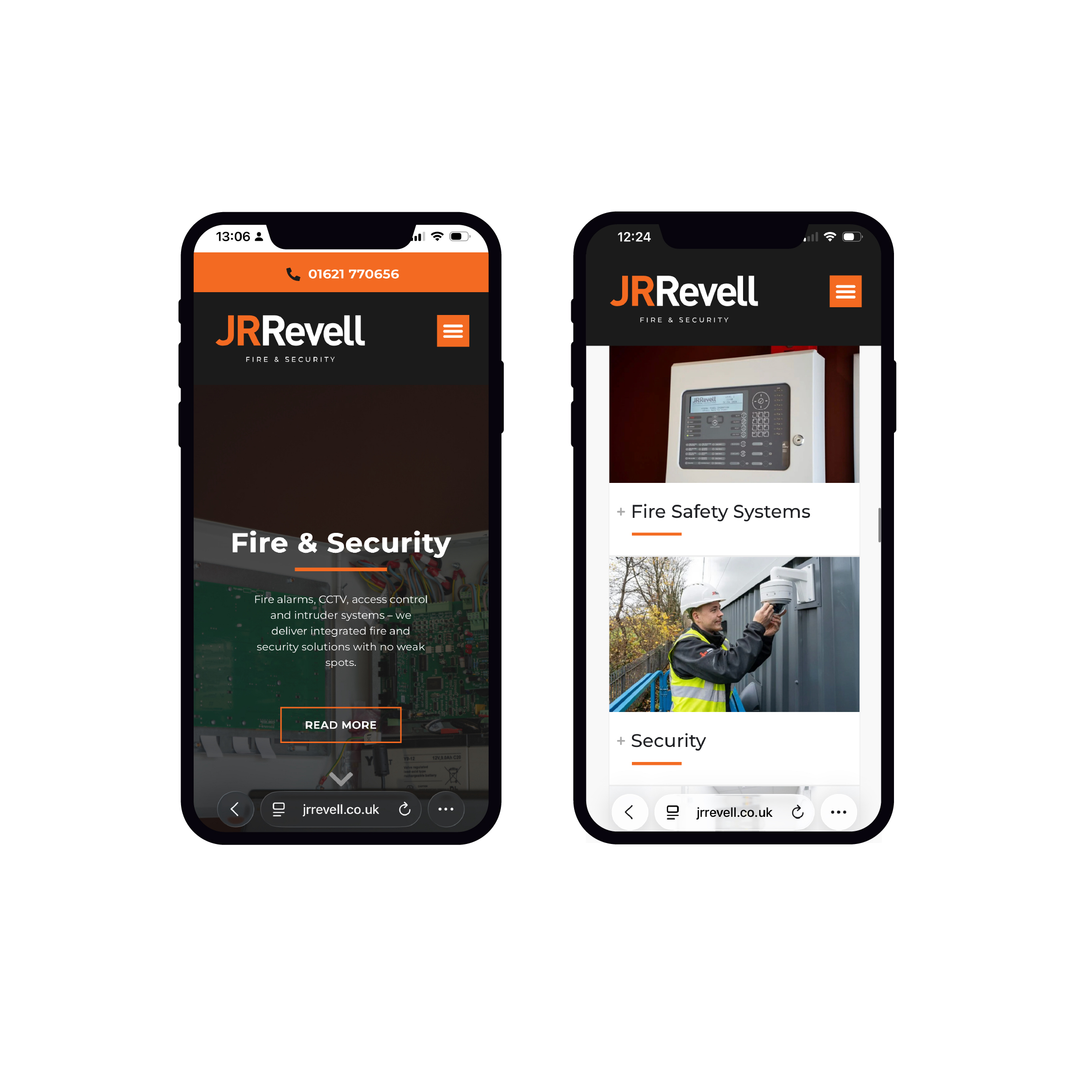
- Fire & Security in orange
- Temporary Services in yellow
- Mechanical & Electrical in blue
Visitors always know which division they are in. Everything still sits under one JR Revell identity, joined up rather than fragmented.
Five Divisions, One Clear Structure
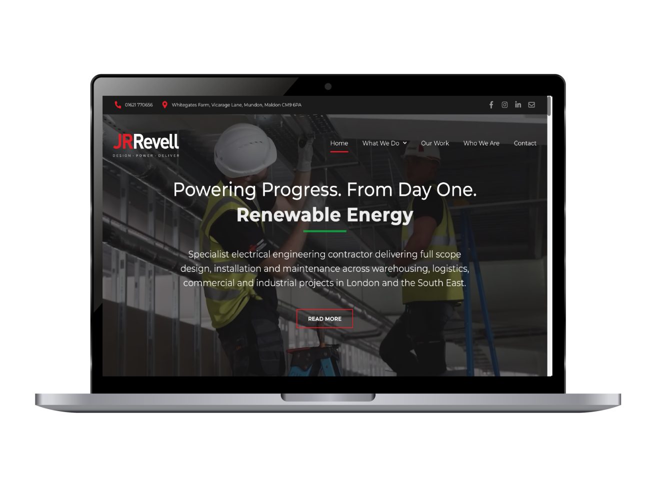
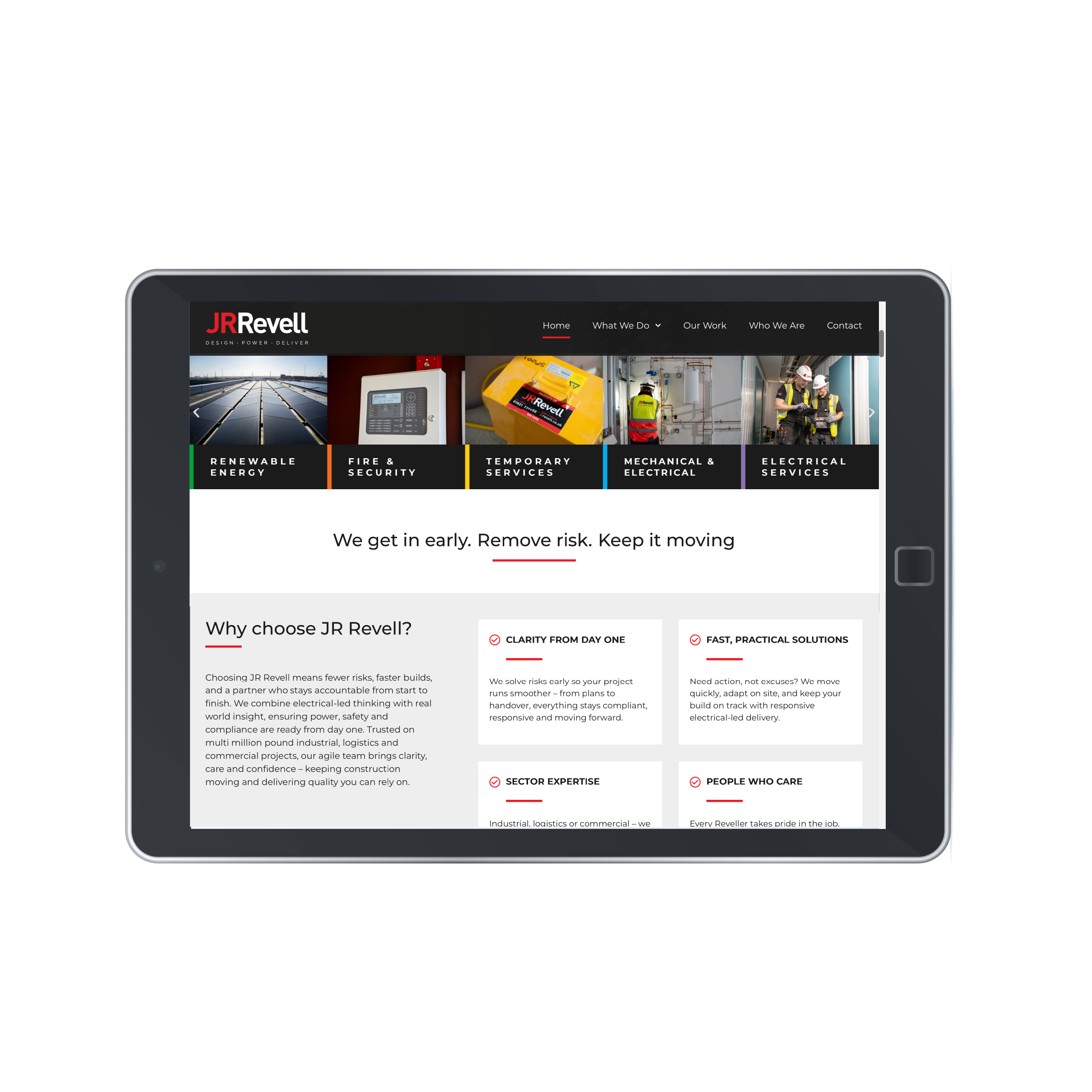
The homepage introduces every division from the first screen. A colour-coded service bar lets buyers go straight to the service they need.
Each division page follows the same pattern:
- A clear statement of what the division does
- Detailed service lists that match how technical buyers search
- A simple process, such as pre-start, site setup and ongoing support
- Related projects from that division
That consistency makes the site easy to use, and easy for the JR Revell team to expand.
Proof That Does the Selling
Commercial buyers want evidence before they pick up the phone. The website puts it front and centre.
- A project portfolio buyers can filter by service
- Client testimonials from named decision-makers
- Industry accreditations, shown throughout the site
- Project cards tagged by division, so every case study supports its service
People at the Front of the Business
JR Revell’s culture is a real differentiator, so we built it into the website.
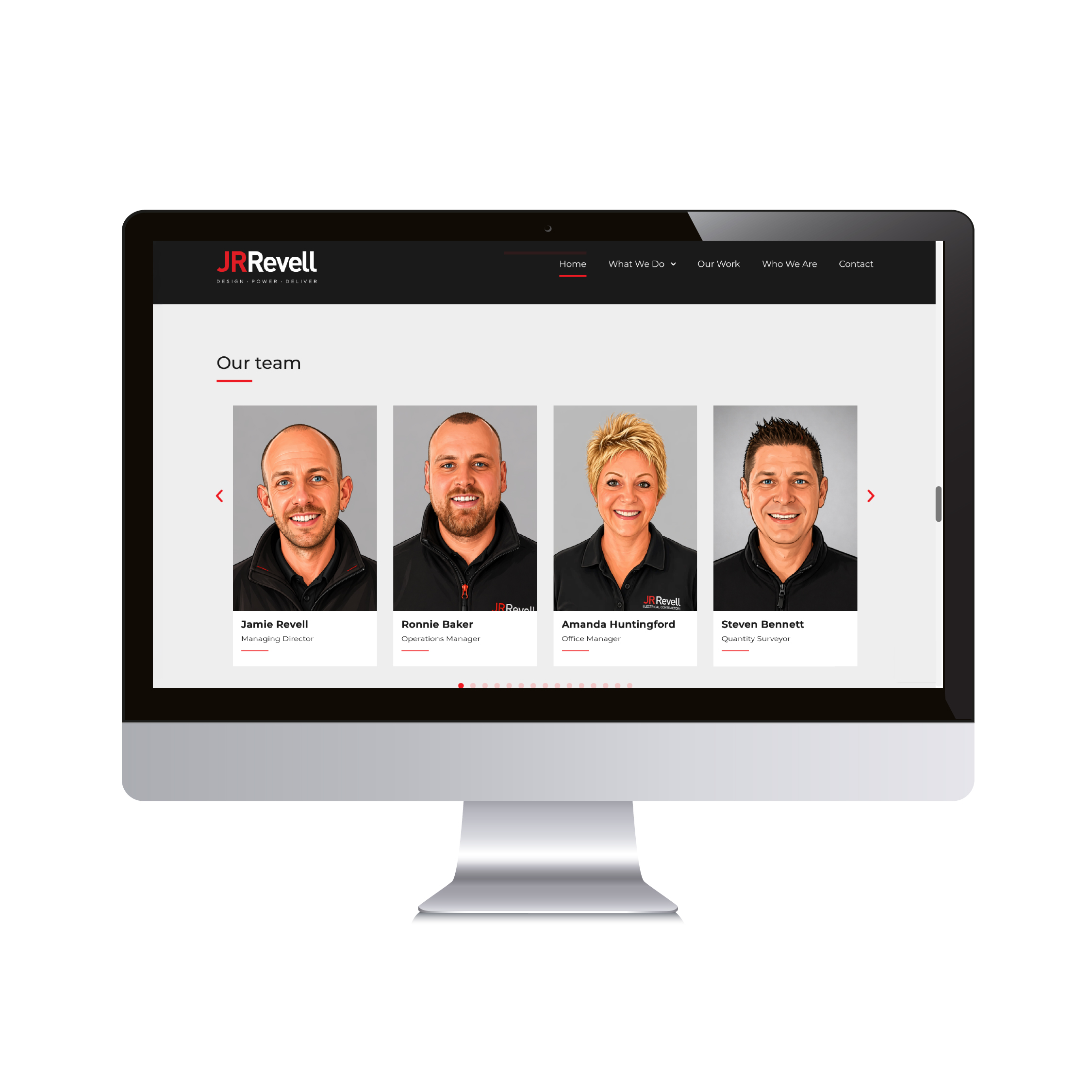
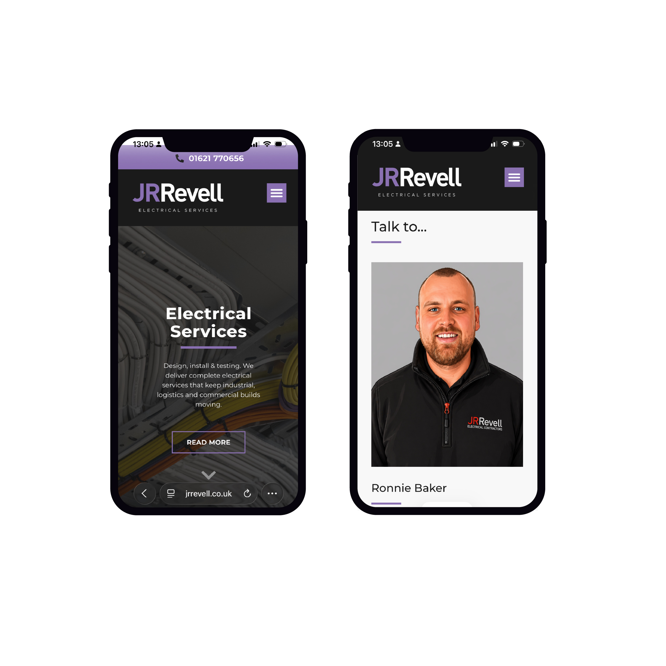
The Who We Are page leads with the site team. A team carousel puts names and faces to every role. Each service page has a “Talk to…” card with a named contact, so buyers know exactly who they’ll be speaking to.
Built for Site and Mobile
Many of JR Revell’s buyers are on site, not at a desk. The mobile experience was a priority from the start.
- A tap-to-call bar in each division’s colour
- Fast, clean service pages that work on any screen
- An enquiry form that routes requests by division
The Impact
The new website gives JR Revell a digital presence that matches the scale and ambition of the business.
Key outcomes include:
- Five divisions presented clearly, under one unified brand
- A stronger platform for larger, multi-service bids and tenders
- Clearer routes to enquiry, from first visit to phone call
- A structure that can grow as new services and projects are added
The rebrand set the direction. The website now carries it to every buyer, on every screen.
Let’s talk about your website
Gallery:





Let’s talk about your brand